Prototype:

app-navigation

If you click the link above, you will be able to open the navigation page in which we had set up and built diagrams to help create and identify each page in being used for the app. The arrows are made to help signify, which page you could click on depending on the criteria you as user would be looking for, if you was to be using this app.

image3

The image shown above is a draft diagram of a smartphone, with a rough drawing of our make-up app, how it would look or how we initially intend to create it and make it look after using app furnace. It shows a draft video tutorial as well as the indication of pressing play. Simple links in order to help our user enjoy using the app as well as identify their personal interest and fulfil it by using this spectacular make-up app.

The diagram also represents that the app is designed for smartphones or tablets in order for the user to use it, also because of some of the data and links contained within it, indicates it cannot be used on old-fashioned phones.

Web & App development: Picture tutorial examples

blush

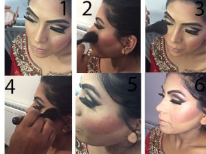
The close-up images above, I had taken whilst doing make-up on my cousin for a event. I had used six images, focusing on contour, blush, brush and structure. In all the images one by one you get to see the structure being used to apply this kind of make-up for this particular look. This look was a ‘party’ look which falls under our subheading, ‘events and party look’

contour

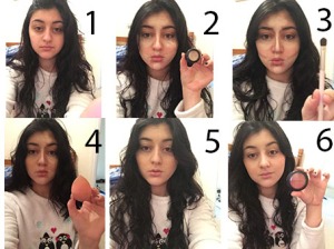
In this image above my co-friend took ‘selfies’, to connote and break down how to ‘contour’ the face, as this a popular way of doing make-up that a lot of people want to learn how to do, via YouTube etc..  This image again breaks down and signifies the users, of the bare face as well as the make-up being applied with the finished look. It also shows the individual products being used and how it is being used so that the users of the app understand and get to note and believe that they can make this look complete for themselves, as it looks easy within 6 different images.

eyebrows

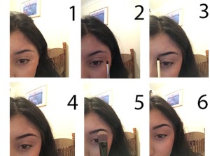
We used different aspects of the make-up used for different parts of the face, as users would want help with certain areas. For example, the ‘eyebrows’ In the image above, their are 6 images put together within a collage, to break it down and help you create the perfect eyebrow look.

We also did video tutorials for different aspects of the make-up, mainly focusing on the ‘everyday kind of look’ as this look is most popular as well as the main look in which will be used.

The video tutorial is a very helpful idea created in which it helps the users and audience who are interested within the make-up field and whom will download the app to use, they will find the video tutorials very helpful as you can see the person, talking directly at the camera as well as breaking down each information clearly, to help users identify, in which product to use or in which product would be most useful for the particular look in which they may be interested in.

After me and my co-friend had produced the images and videos which were going to come to use within the app, as a group we had edited it to define and perfect it to the best in which it could be for our users to be happy with and use, as well as making it successful.

Web & App development: Week one – App planning:

image

Web and app development is one of the most creative, fun as well as challenging tasks in which we were given to do. Within this lesson, we were able to identify how to create your own app, by using ‘App Furnace’ – Which was an app, to create your own one. We had all downloaded this onto our each individual smartphone or tablet to view what the app had looked like and get a simple idea of how it had worked.

In the above image, is a brainstorm of some of the ideas in which we had come up with to produce an app with app furnace. Which is the actual app, we use as a group to produce our own initialised app for a target audience to use. We came up with the idea of a ‘make-up’ app. We thought this was a good idea to take forward as in this generation, make-up has increased popularity so therefore this app was bound to work and become successful. This was the motivation in which we had to carry, in order for us to complete this task.

image

Once we had established what the app was going to be about, we then had to focus on what pages we was going to produce within the app for the app to be successful and complete the task. We handmade a storyboard, which is in the image above. This connotes, the understanding of four pages and what was going to be included within the app. We had summarised four subheadings which fall under make-up, to make it easy for our viewers and users to use without having any complications or difficulty whilst having to use the app. Within our app, we wanted to use make-up tutorials, pictures, links, summaries and listed names of make-up purchases in which we had used and where you could find them. This was an initial idea which we wanted to produce to help the ‘user’ identify and help them use this app for their own interest.

Later on, we then started to develop the target audience in which we wanted to aim at for this app. This was a rough age between 15-25 year olds, as the younger generation in this day and age today have passion for make-up. We then were able to focus on the theme, colour, icons etcetera in which we wanted to use to make it look appealing for our target audience.